

Mastering Brand Identity: A Strategic Guide to Color Selection and Psychological Impact
How Strategic Color Choices Shape Brand Perception and Connection
In the art and science of branding, color selection is far from a mere aesthetic decision — it's a strategic choice that significantly influences how a brand is perceived and experienced.
The right colors can communicate a brand's identity, evoke specific emotions in the audience, and even influence consumer behavior.
Understanding the psychology behind color choices and how they can be used to align with a brand's values and objectives is crucial for creating a powerful and cohesive brand identity.
The power of color cannot be overstated.

Understanding Color Psychology and Brand Identity
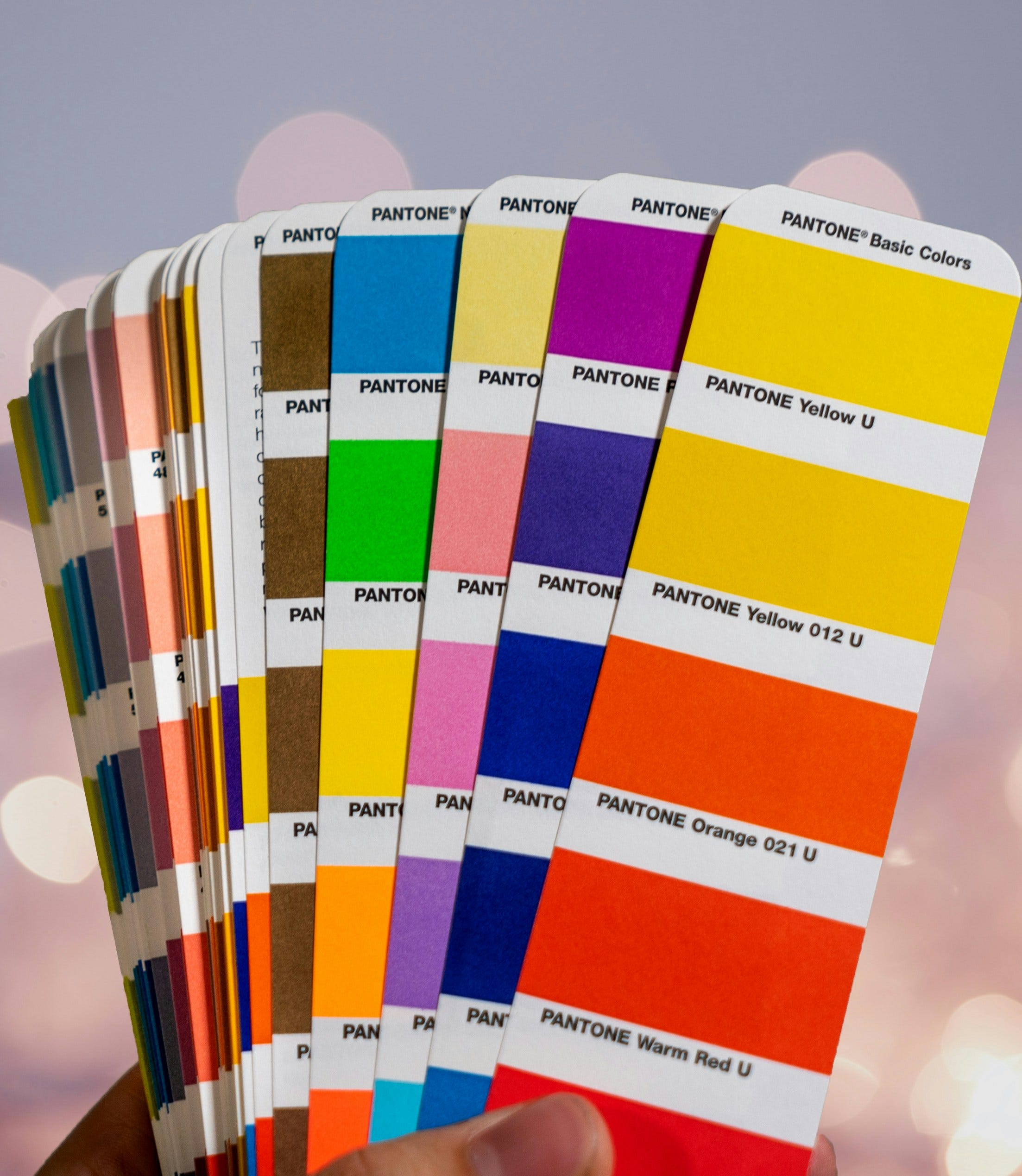
To leverage color psychology effectively, it's important to understand the emotions and behaviors different colors can evoke. Here's a brief overview:
- Red: Energy, passion, action, urgency.
- Orange: Creativity, friendliness, enthusiasm.
- Yellow: Optimism, happiness, warmth.
- Green: Growth, renewal, health.
- Blue: Trust, calm, reliability.
- Purple: Luxury, spirituality, mystery.
- Black: Elegance, sophistication, power.
- White: Purity, simplicity, innocence.
Incorporating Color Psychology into Branding
Successful brands use color psychology to their advantage, crafting identities that deeply resonate with their target audiences. For example, the use of green by eco-friendly brands communicates their commitment to sustainability, while luxury brands often opt for black to convey elegance and sophistication.
Choosing Your Brand's Colors
When selecting colors for your brand, consider the following steps to ensure your choices align with your brand's identity and goals:
1. Understand Your Brand's Core Values and Personality: Choose colors that reflect what your brand stands for.
2. Consider Your Target Audience: Think about the emotional and psychological impact your chosen colors will have on your target demographic.
3. Analyze Competitors: Look at the colors used by competitors to ensure your palette differentiates your brand.
4. Experiment with Color Combinations: Use color theory to find complementary and analogous color schemes that work well together.
5. Test Your Colors: Get feedback on your color choices from potential customers to see how they resonate.
Finalizing Your Palette: The Top 5-8 Selections
Narrowing down your color choices to a palette of 5-8 selections allows for versatility in your branding while maintaining coherence. Your primary color should dominate, supported by secondary colors that complement or contrast effectively, along with neutral tones for balance.
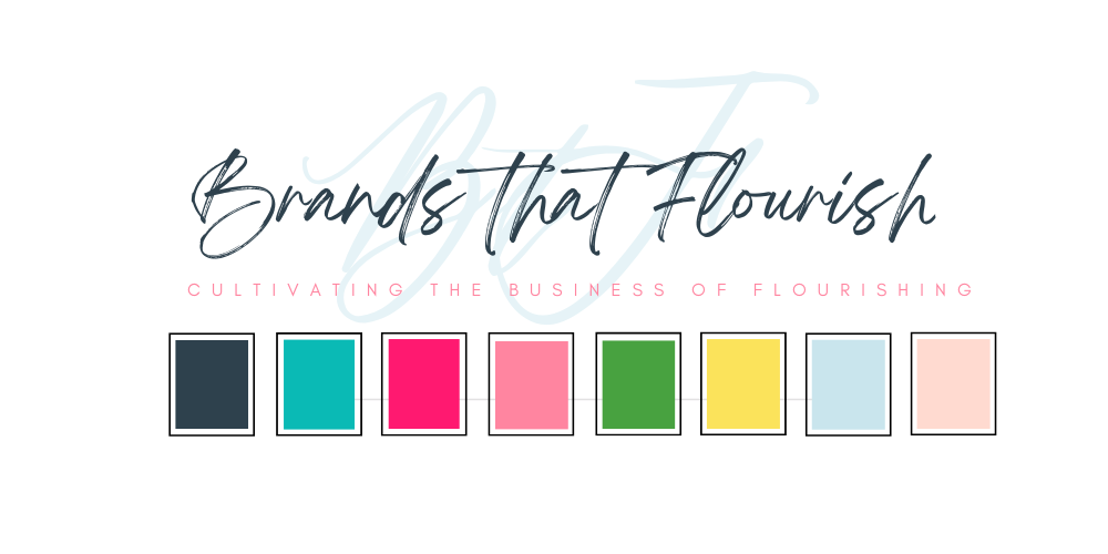
The decision to embrace a bouquet of colors for "Brands that Flourish" exemplifies a strategic approach to color selection that goes beyond aesthetics. It's about choosing colors that not only align with the psychological impact that I aim to achieve but also energize me and reflect my brand's unique identity.
Integrating Personal Resonance and Color
The inclusion of these colors reflects a deep understanding of how colors evoke feeling and connection, with each choice intended to elicit specific responses and convey particular values. However, the palette also carries personal significance, with each color resonating on a level that energizes the brand and infuses it with genuine passion. This personal connection to the brand's colors ensures an authentic and engaging experience for the audience.
Crafting a Brand Identity That Resonates
For businesses and creatives embarking on the journey of brand development, the "Brands that Flourish" color palette serves as a case study of how to choose colors that align with brand psychology while also resonating on a personal level. It demonstrates the importance of selecting a primary color that anchors the brand's identity—like teal for "Six Figures on the Side"—complemented by a spectrum of colors that enrich the brand's narrative and emotional appeal.
The Choice of Teal for "Six Figures on the Side"
Teal (#0abab5), a blend of blue's tranquility and green's renewal and vitality, embodies a perfect balance that is both calming and energizing. This color was chosen for this newsletter not only because it's a personal favorite and one of my business brand’s colors, but it also energizes and inspires.
It encapsulates the essence of what I want this community to stand for - growth, creativity, and balance. Teal suggests a forward-thinking and innovative approach, aligning with the mission to help entrepreneurs not just grow but thrive in a competitive landscape.
And, Brands that Flourish:
- Deep Green (#2e414d): This shade adds depth and represents stability, echoing the brand's promise of enduring growth and reliability.
- Pop Pink (#ff1970): A vibrant, eye-catching hue that injects energy and conveys the brand's dynamic, innovative spirit.
- Petal Pink (#ffdad0): A softer, nurturing color that adds a touch of warmth and approachability to the brand’s visual identity.
- Preppy Pink (#ff95ad): A playful yet sophisticated tone, reminiscent of a pair of shoes from Talbots. This color infuses the brand with a distinctive, stylish flair.
- Soft Blue (#c2e8fe): Evoking clarity and calm, this hue complements teal, reinforcing the brand's commitment to providing a serene, trustworthy presence.
- Yellow (#fbe35b): Introduced during a period of grief, this bright, sunny color symbolizes hope, resilience, and the brand’s capacity to bring light during challenging times.
- Grass Green (#48a240): Represents growth and renewal, underscoring the brand’s focus on continuous development and flourishing potential.
In choosing exactly how you want to articulate your brand, you create what is not only visually appealing but also deeply connected to your values and vision, poised to make a lasting impact in the hearts and minds of your audience.
Selecting Your Brand’s Colors: A Strategic Approach
When choosing colors for your brand, consider the following steps to ensure they align with your identity and resonate with your target audience:
1. Reflect on Your Brand’s Core Values and Identity: Begin by understanding the essence of your brand. What are its core values? What personality do you want your brand to project? Select colors that reinforce these aspects.
2. Understand Your Target Audience: Different demographics and cultures can react differently to colors. Consider the preferences and perceptions of your target audience when selecting your palette.
3. Analyze Competitors: Look at the color choices of your competitors to identify opportunities to stand out. Choosing a distinct color can help differentiate your brand in a crowded market.
4. Consider Color Combinations and Balance: While a primary color will lead your brand’s visual identity, additional colors should complement or contrast effectively. Use color theory to select a harmonious palette.
5. Test Your Colors with Your Audience: Before finalizing your palette, gather feedback from potential customers to see how the colors resonate with them. This can provide valuable insights into the emotional and psychological impact of your choices.
Implementing Your Color Palette
Once you've selected your brand's colors, consistent application across all brand touchpoints is key. Whether it's your website, logo, packaging, or marketing materials, maintaining a consistent color scheme reinforces brand recognition and enhances the overall brand experience.
What colors resonate with you and your brand?